Hey, did you know you’ve got just 15 seconds to win over your website visitors? It might not seem like much time, but trust me, it’s all you need to make a killer first impression and keep them coming back for more.
Picture your website as your own personal playground—a place where your ideas come to life and your business thrives. But for your visitors, it’s a fleeting moment in their online journey. They’re searching for something specific, something that speaks to their needs and interests.
But don’t worry! Those 15 seconds? They’re your chance to shine. In this article, I’ll show you how to turn your homepage into a magnet for curious visitors, enticing them to explore further and discover all you have to offer.
So, are you ready to make the most of those 15 seconds? If you’re eager to learn how to create a high-converting website, you’re in the right place!
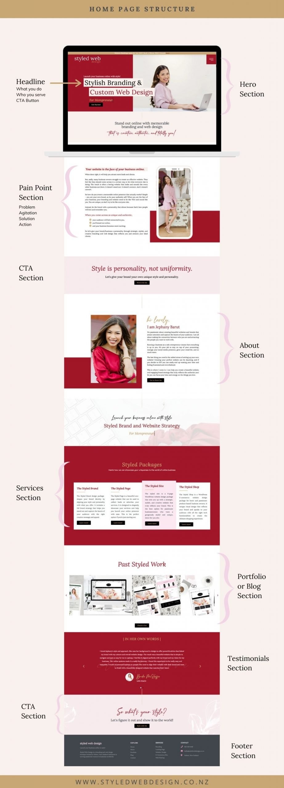
Let’s kick things off by breaking down the essential sections you need to focus on for your homepage:
1. Come up with a catchy Hero Section
First of all, we have what I call the hero section. As the name implies, it should be a promising section, since it is the first thing the user sees when entering your page. The key formula to build a hero section that fulfills its function, will include: A great photo that supports your headline, a consistent description, a brief description of what you offer (both must include keywords, take note) and a clear call to action.
2. Show yourself as a problem solver on your pain point section
In the second part of your page, the user already knows everything about you, but they still don’t know what you can do for them. This is the time to be clearer than ever.
This section called the pain points section will include all the problems that your ideal client has and needs to solve. You are going to tell who you are talking to and from what place, making it clear that you have the knowledge and the will to help them solve what is getting out of their hands.
For this section to be effective, it must include an important detail: talk about all the things that your client miss because of that problem to show them that it is something that cannot, but must be solved. You need to pinpoint your ideal client problems here so they know that you can help them, and that they really need that help.
This section needs clarity and empathy, knows who you are speaking to well and shares a sensible and transparent message.
3. Showcase solutions with clarity and detail
After talking about those pain points, your clients know that they need help, so let’s talk about solutions. It is time to explain what you do and how that can help them with their needs. This is the section to provide all the information that the client needs to know about your solution and your experience, so be as specific as you want to!
4. Let’s be real about your why in your about me section
The about me section should include a photo that builds confidence and a text that talks about your motivations and results instead of the concepts of your profession. Here the person will be able to know why you want to help them and what tools you have to do it. To make this helpful to the navigation of your website, remember to add only a short paragraph and a call to action that allows the user to go to the page of the site where they can see all the full text.
5. Show your services to that ideal client
Now, it’s time to shine a spotlight on your services, showcasing each one with confidence and clarity. Provide a concise overview of what you offer, emphasising the unique benefits and value proposition of each service. And don’t forget to sprinkle in a few testimonials—words of praise from satisfied clients can work wonders in building trust and credibility.
6. Time for a call to action
As you near the end of your homepage journey, rally the troops with a compelling call to action. Whether it’s a freebie, a consultation, or a special offer, make it irresistible and impossible to ignore. This final invitation should leave visitors eager to take the next step on their journey with you.
7. Build trust with authentic testimonials
Bolster your credibility with authentic testimonials from satisfied clients. These glowing endorsements serve as social proof, reassuring visitors that they’re in good hands. By showcasing real-life success stories, you’ll inspire confidence and encourage conversions.
8. Share the best content from your blog
Elevate your homepage experience by spotlighting the cream of the crop from your blog. This curated selection of top-tier content serves as a gateway to deeper insights and knowledge, enriching visitors’ understanding of your expertise and offerings. From insightful guides to captivating narratives, each piece of content offers a glimpse into the depth and breadth of your knowledge, empowering visitors with valuable information and inspiration.
9. Leave your details on that footer to convert
As visitors journey to the bottom of your homepage, seize the opportunity to make a lasting impression with a strategically designed footer. Here, you can provide essential information and seamless navigation options to enhance user experience. Include menu items for easy access to key sections of your website, ensuring visitors can continue their exploration with ease. Additionally, prominently display your social media accounts, inviting visitors to connect with you beyond the confines of your website. And for those ready to take the next step, consider adding a compelling call to action for a quick chat or consultation, making it effortless for interested prospects to convert into valued clients or customers. With a well-crafted footer, you can leave a lasting impression and pave the way for meaningful connections and conversions.
To see a real example, have a look at my own website below.


Hey! Do you know if they make any plugins to protect against hackers?
I’m kinda paranoid about losing everything I’ve worked hard on. Any recommendations?
Wordfence Security